EspanholMinuto
- CLIENT
- Espanhol Minuto
- COUNTRY
- Brazil
- YEAR
- 2026
- SERVICE
- Branding
“Our students are in Spain, but our brand wasn’t.”
Espanhol Minuto is an online Spanish school for Brazilians who live in or are moving to Spain, with over 100k followers on social media. The old brand relied on Latin American imagery, like the sombrero, which had nothing to do with what the school teaches. They wanted an identity rooted in the Spanish of Spain, while keeping “Minuto”, which always defined the school: clear, focused teaching that respects the student’s time.
Spain instead of the cliché, with the minute at the heart of the brand.
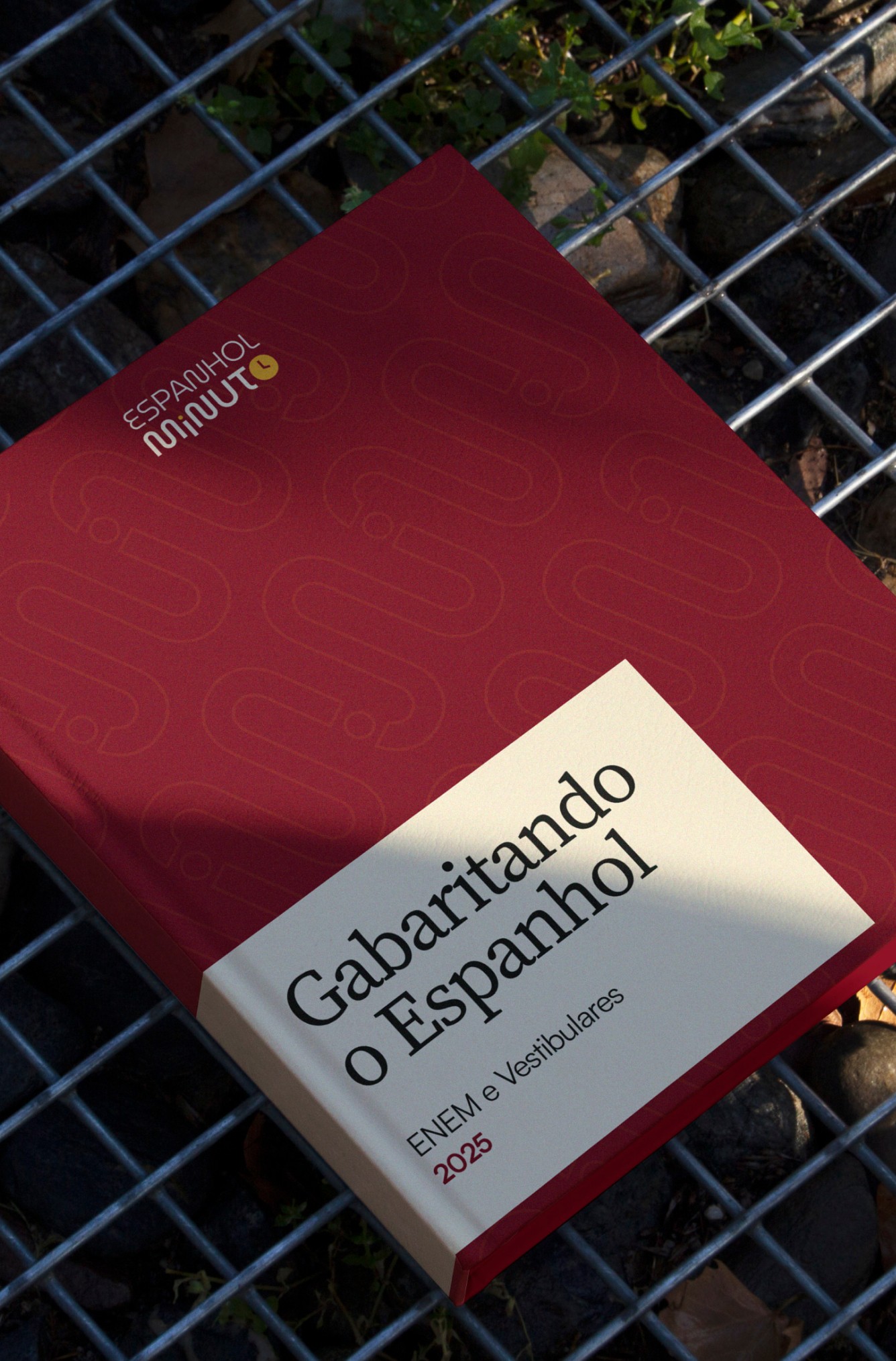
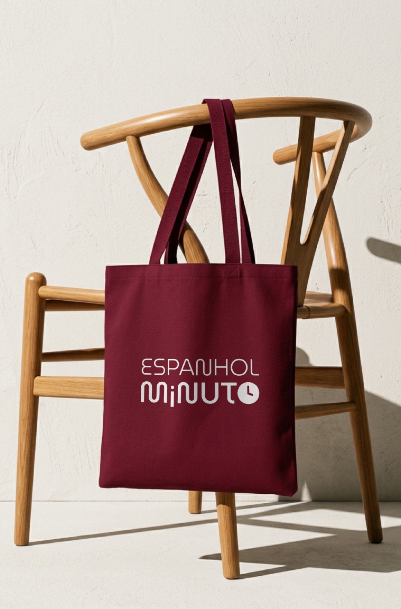
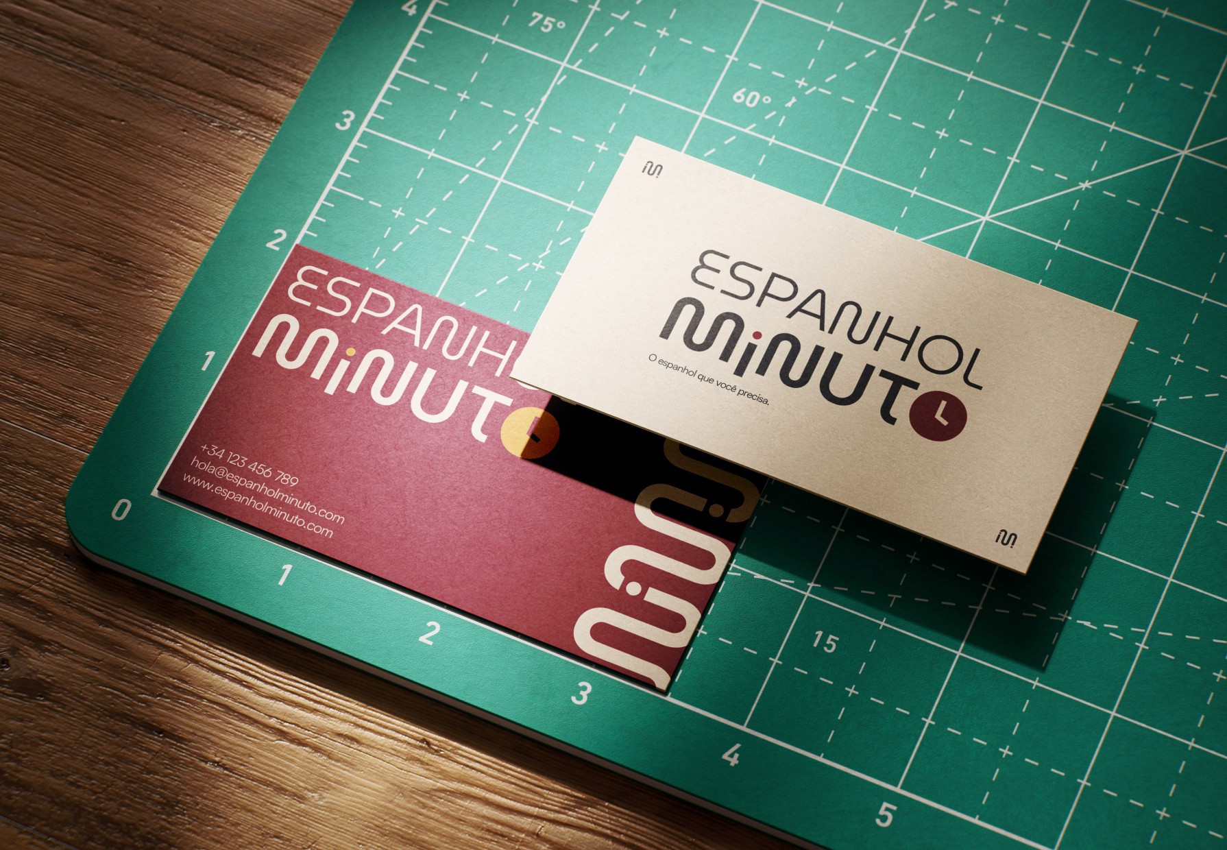
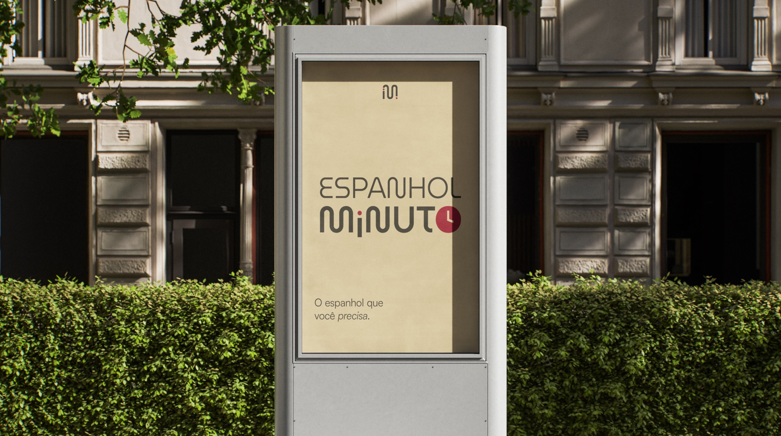
We started with strategy: mission, values, personality and a tone of voice that is clear, precise and warm. In the logo, the “o” in Minuto became a clock, and the “i” took the shape of the Spanish inverted exclamation mark (¡). The symbol brings both ideas together in a single shape.
The palette came from Spain: wine, saffron, olive, mist, cream and charcoal. The graphics draw on Spanish architecture (arches, patios, tiles, fans and the sun), reduced to simple shapes. The result is a more mature brand that works everywhere, from reels to course materials.